Bratex

Branding for the roof system manufacturer.

Client

Bratex

Scope of work

Logotype
Product branding
Product catalogs
Affiliate catalog
Design of delivery trucks wrapping
Other BTL materials

Bratex Dachy is a company specializing in the production and sale of high-quality roof plates and the Struga gutter system. The company has been operating on the market since 1991, and in 1996 it became a direct importer of the Scandinavian SSAB group, a global leader in the production of high-strength steel. Until today SSAB is a leading supplier of the company.

Bratex Dachy products are characterized by high quality, the solidity of workmanship and excellent technical and utility values. Innovation, creativity and many years of experience enable the company to design unique product solutions, fully adapted to the expectations of the most demanding customers.

Challenge

The company came to us for a design project of a catalog, but after analyzing the visual identification system, we noticed that a lot of chaos and inaccuracy crept into it. Five hundred distributors on the Polish market and 11,500 m2 of modern space created in 2017 oblige the company to have clearly defined and refined brand guidelines and a coherent image. We had to take care of it first.

The old mess

Solution

We designed the whole system of signs identifying and systematizing a wide family of products. Coherence and consistency prevailed, qualities necessary for brand recognition and awareness. The system is easy to expand with new products, so it is fully adapted to the company focused on continuous development.

Brand guidelines for product signs

The names of individual products are based on the “signet” of the logotype, which after the lifting we carried out better reflects the stability and reliability of Bratex Dachy.

The elements of coherent branding

The technical aspect, emphasized by ubiquitous lines referring to the roofs and gutters, is the basic feature of Bratex Roof’s visual identity. The colors are economical but strong. Dominatinating: red – brand and accent color as well as gray, accompanied by white and black. Everything is described in two simple, accessible typefaces and supported by a coherent set of icons that clearly illustrate the most important features of the product. It all creates a coherent system in which every element of branding has a clearly defined place and rules of application.

Result

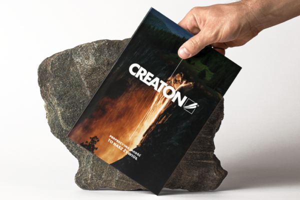
The Bratex Dachy brand, as well as all products that are subbrands, have a systematic visual identification, thanks to which the whole brand ecosystem is recognizable and through its order, they communicate the reliability and stability of the brand, which makes it perceived as a trustworthy partner and solution provider of roof systems. This results in a sales increase.

Want to work with us?
Tell us about your brand and what you need for its development.
We will contact you and talk about the details.
Similar projects

CREATON

Perfect quality is our element!  A product catalog with an expressive theme that perfectly reflects the character of the brand, a leader in roofing solutions.

Triflow

A new brand on the commercial real estate market

This website has been designed for vertical viewing. Please turn your device.

Our website uses cookies. By using our site you must agree the cookies privacy policy. I accept the Cookies Privacy Policy.

I accept