

Stand out from the competition by speaking the language of benefits
Our challenge was to present the offer in a transparent and understandable way for the recipients. The overriding goal was to diagnose the rational and emotional benefits resulting from cooperation with Language Assessments and to provide them through a functional, user-friendly website that speaks in the language of benefits.
Change the way you think about communication
We wanted to emphasize that Language Assessment builds a relationship of trust, and the client knows from the very beginning that he can entrust his processes to the brand without any worries. We faced the challenge of rebuilding the information architecture and designing new UX / UI solutions that will allow the user to get to know the service, be convinced about its value and place an order.


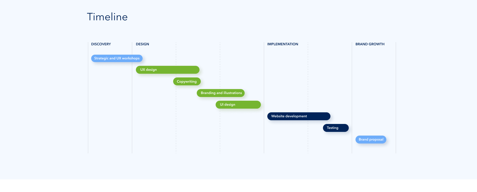
Strategic directions of development
After defining the strategic direction and a creative concept, we started working on the website design, information architecture and individual illustrations. We focused on a transparent presentation of the offer and benefits, as well as dedicated illustrations that added lightness and a unique character to the project.
Only the one who wanders finds new paths
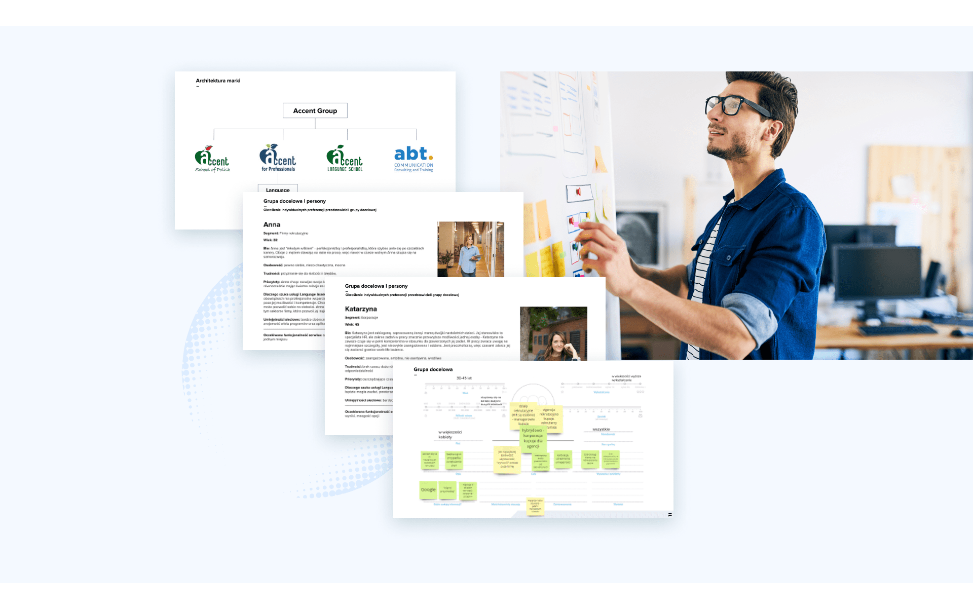
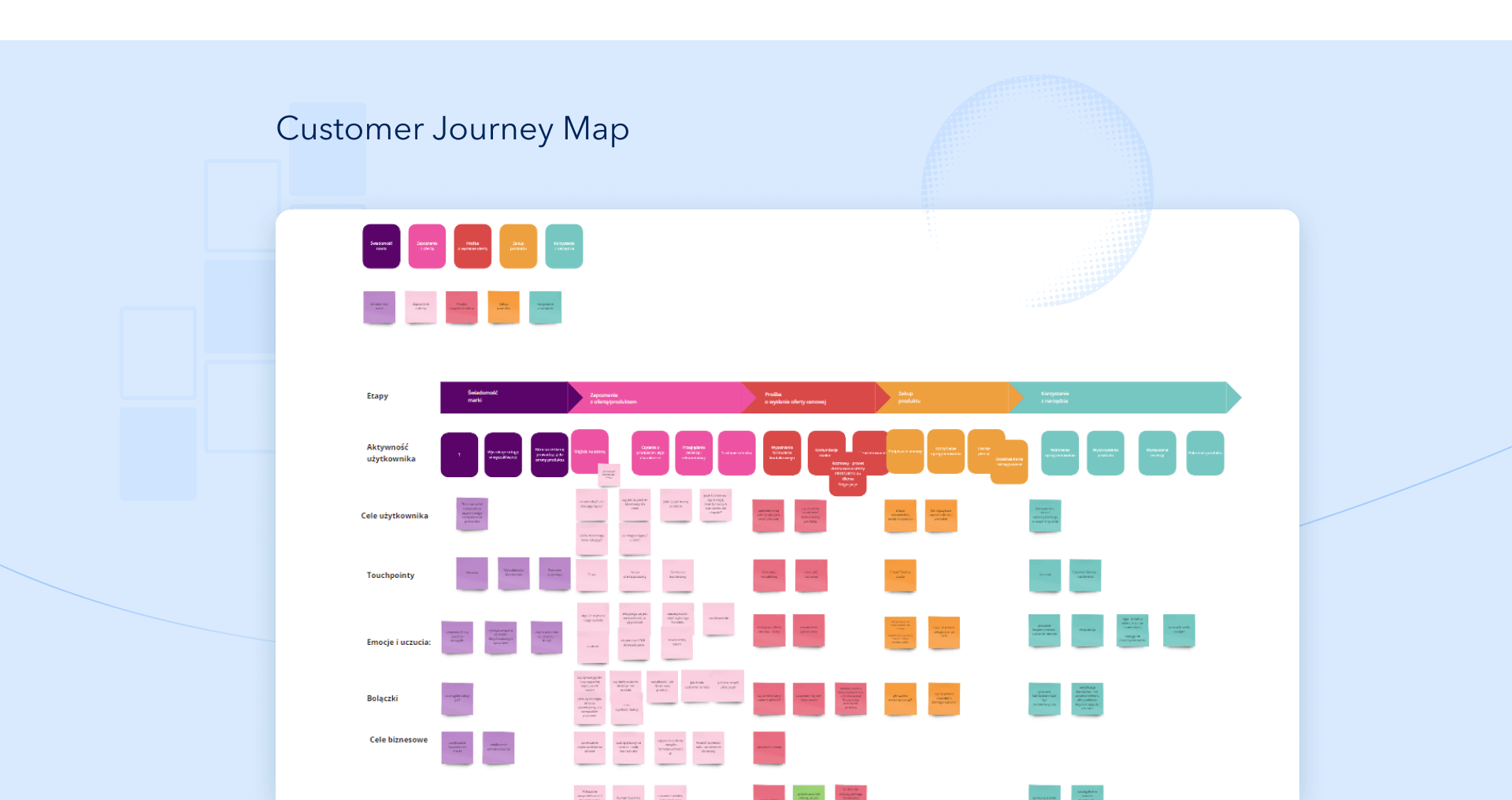
In line with this Norwegian proverb, we decided to discover and analyze the service purchasing paths of Language Assessment clients. For this purpose, we have mapped the Customer Journey Map together to facilitate the interaction with the company and the service as much as possible and to support him at every stage of contact with the brand. Our overriding goal was to get to know our clients’ motivations and mental processes even better so that the solutions we recommend fully meet their expectations and enable intuitive and comfortable navigation on the website.
Branding that reaches the target audience
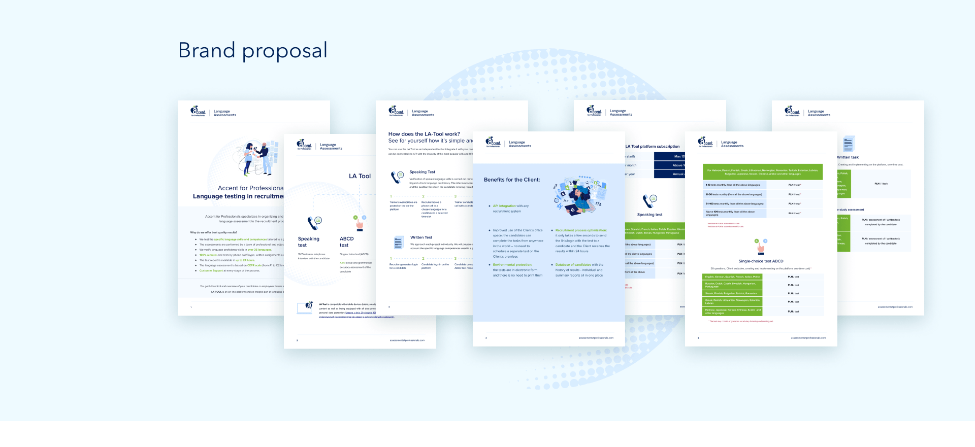
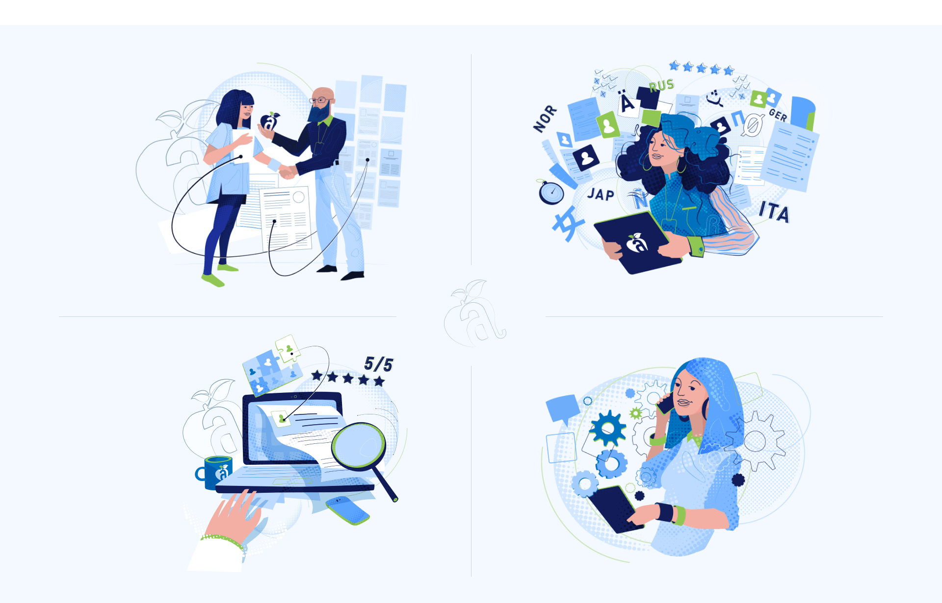
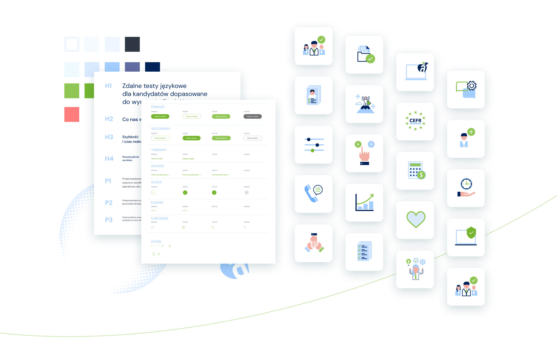
The results of the analyzes became the starting point for creating a unique branding for the Language Assessment by Accent for Professionals service. Our base was company colours (blue and green), which resounded again in dedicated icons and illustrations, designed in the Corporate Memphis style. Clean lines, geometric shapes, expressive colour palette – all this offers an extremely simple view of the world and effectively corresponds with the target group, which includes representatives of HR departments of large companies and corporations. When designing the illustrated characters, we wanted to maintain a balance so that the amount of details pleases the eye and at the same time does not disturb the message.
User support at every stage of the purchasing path
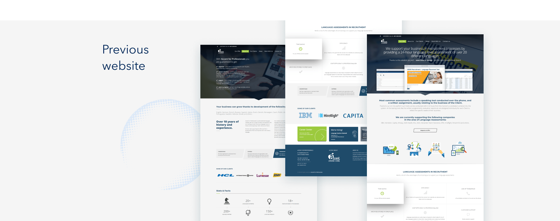
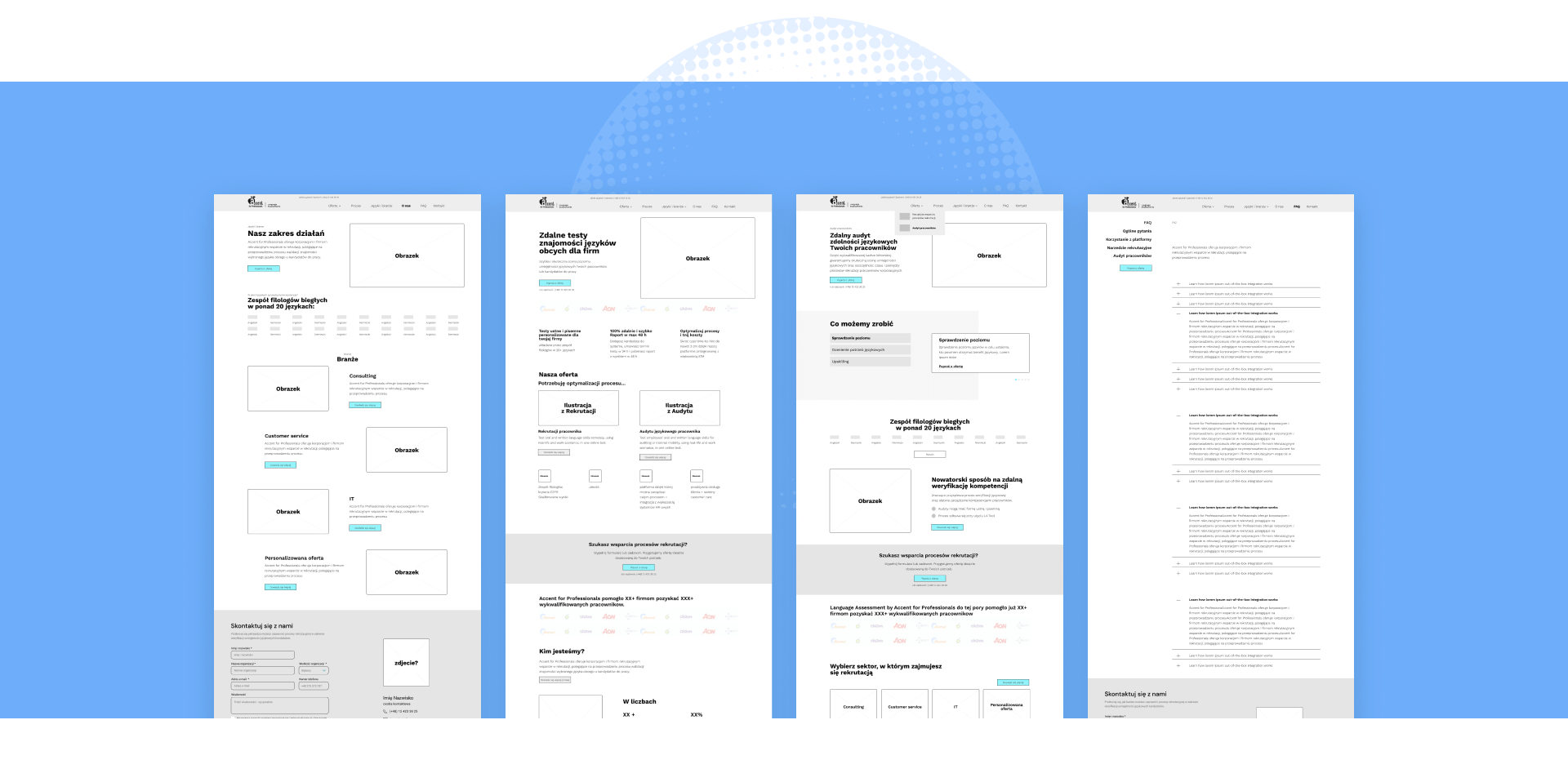
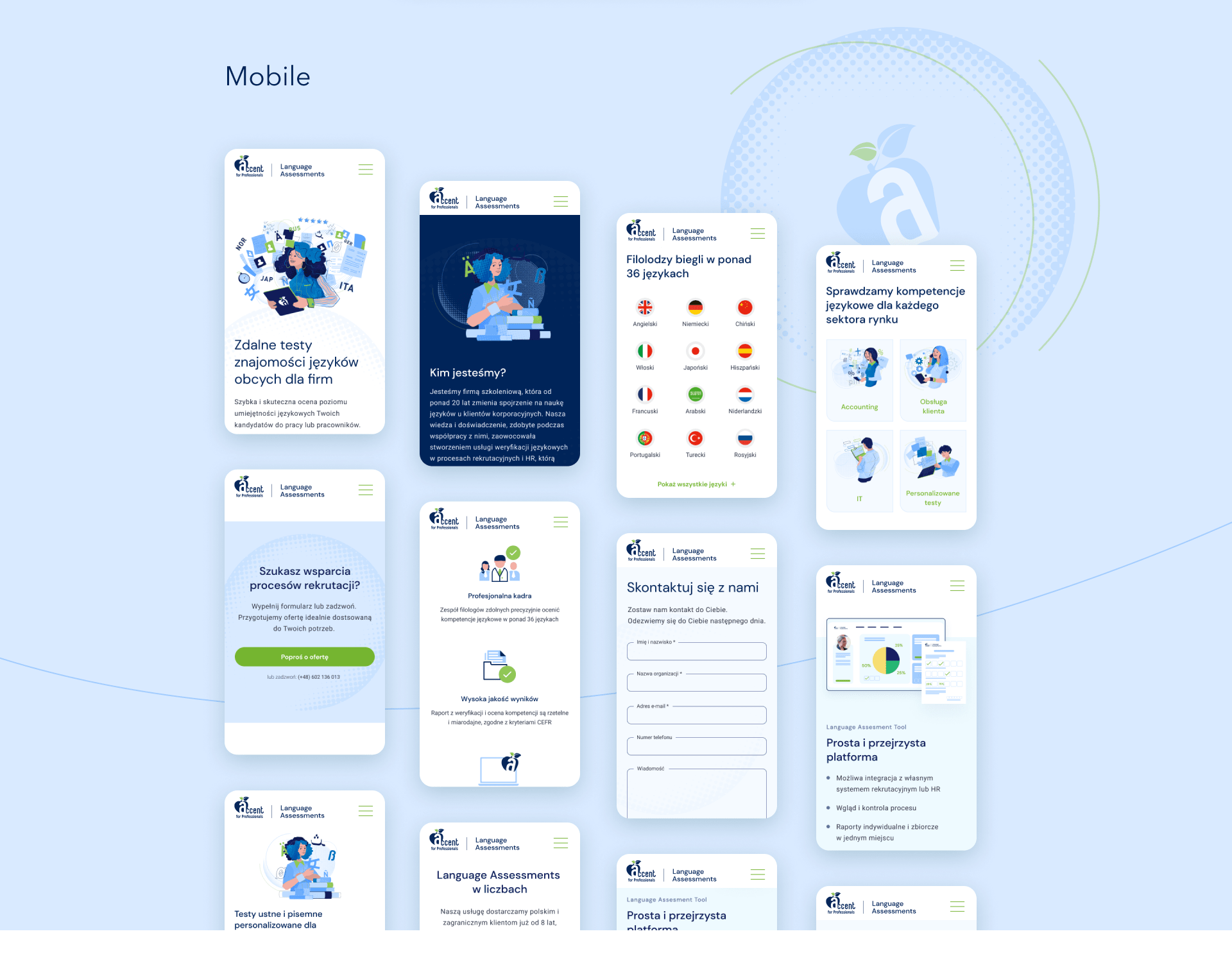
Thanks to well-thought-out and intuitive UX / UI solutions, we have created a transparent and modern website that supports recipients at every stage of the purchase, allows you to quickly familiarize yourself with the offer and emphasizes the benefits of using Language Assessment services. The website has become user-friendly thanks to well-thought-out information architecture and good UX practices that allow the user to quickly interact with the website and redirect to appropriate actions.
Modern & useful design
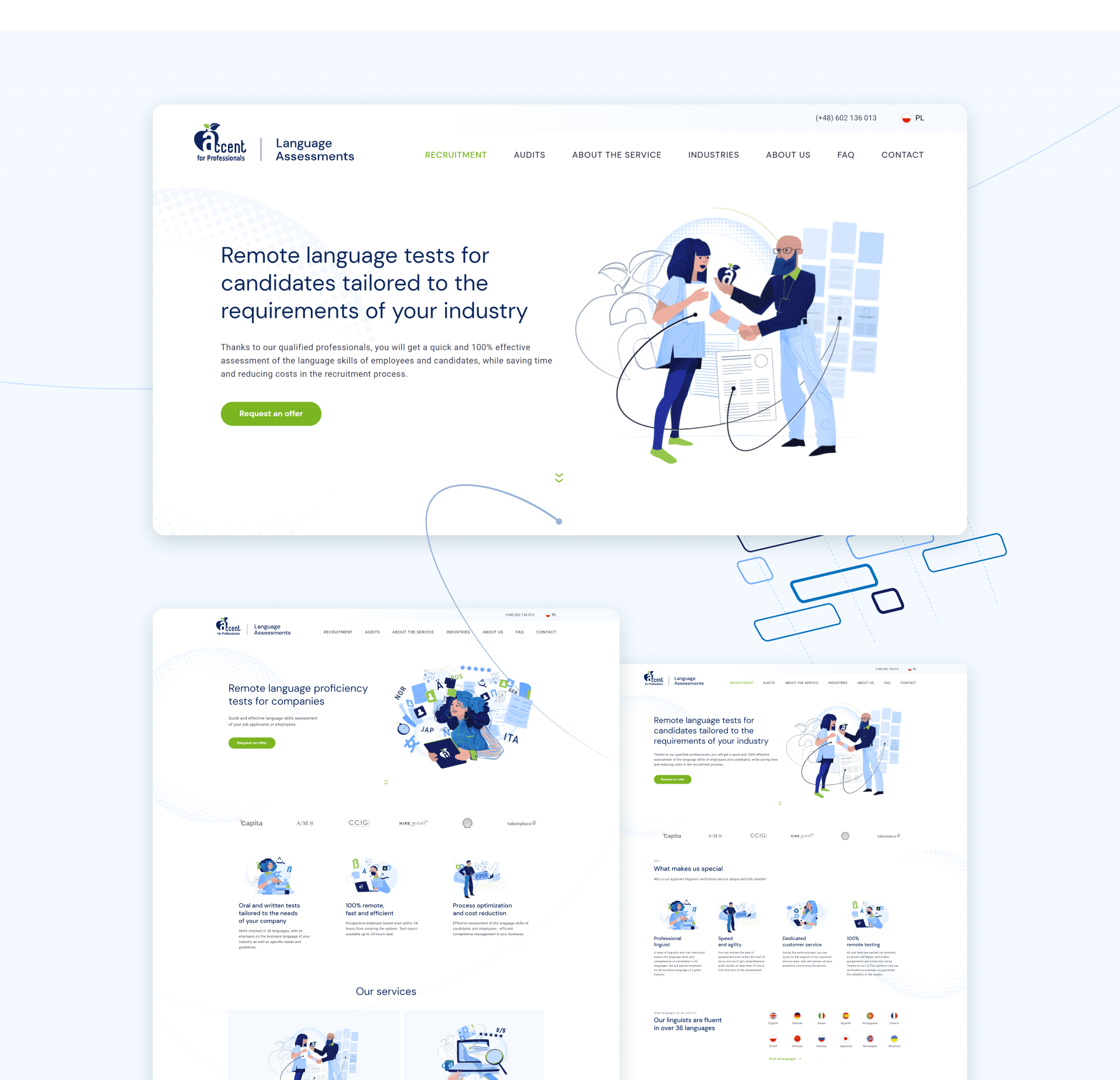
Defining the feelings, problems and needs of customers helped us to design the website in such a way that it was user-friendly, convinced to cooperate and encouraged to use the offer many times. The effect was intensified thanks to texts tailored to the SEO requirements and the target group, as well as dedicated illustrations with a parallax effect, which add lightness, dynamism and make the website more pleasant to read.
Landing pages that convert
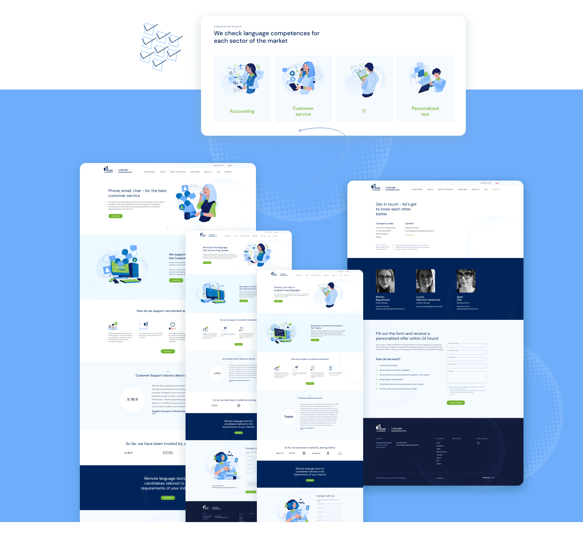
We know that apart from design, it is of great importance to maintain a high conversion rate, which is why we proposed a solution in the form of dedicated landing pages, which were designed specifically for the needs of future marketing campaigns. We focused on defining narrow target groups to make sure that marketing activities will be precise, and most importantly – will bring the expected effect.

Increasing sales and building a strong position on the market
The number of website views and the conversion rate have increased. Everything from the clean structure of the website to its modern and professional look and comprehensive illustrations resulted in an engaging and inviting user experience, which translated into sales results.
Strengthening and harmonizing the brand image
Thanks to our concepts and their implementation, we strengthened the brand image, distinguished it from the competition and designed positive customer experiences. Our work contributed to increasing brand awareness and positioning it as an experienced, professional and committed partner.
We will contact you and talk about the details.
This website has been designed for vertical viewing. Please turn your device.


