Smart sleep mask

Client

Inetliclinic

What we did

Branding – Logo & Corporate idenity
Sales print materials
Website – Concept, UX, UI, Interaction Design
Mobile app
Photo session
Other BTL Materials
Display

NeuroOn is a smart sleep mask created by Inteliclinic for the purpose of monitoring and having an active influence on the quality of sleep. It was an unconventional order because the need for branding arose only after the presentation of the product within the framework of a crowdfunding campaign on Kickstarter. For the ready mask, it was necessary to create a key visual, prepare a communication strategy and design a website and an application.

In order to understand the idea of NeuroOn, we must refer to the reality of constant lack of time. Because of the increasing pace of life and the larger number of stimuli, the brain needs solid regeneration in the form of sleep in order to function properly. Unfortunately, this sleep is often improper.

Scientists examining this issue divided sleep into four key phases: falling asleep, light sleep, deep sleep, and REM. They also found that the entire cycle lasts around 90 minutes. In order to achieve full regeneration, an adult needs four to six full cycles during one 24-hour day. An overwhelming majority of people sleep on a monophase basis – once per day. However, outstanding people such as Leonardo da Vinci or Salvador Dali used a completely different solution: polyphase sleep – a series of several short naps. However, this kind of sleep is difficult to control for an individual. The goal assumed by the creators of NeuroOn is to solve this problem.

Selling the idea

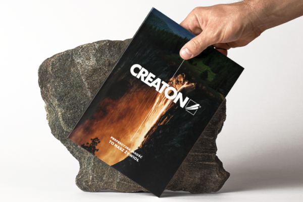
The branding process started with a meeting with the target group, which consisted of persons interested in stretching their day by a few more hours and open to new technologies. Among potential buyers of the device, there were also frequent flyers exposed to jet lag effects because of time zone changes. Tests showed that NeuroOn mitigates the consequences of jet lag. This idea had to be expressed in visual form. Sales materials, such as folders, business cards, leaflets, and roll-ups, were designed in this fashion.

Website

The black color style of the website refers to sleep and night it is associated with. Only “call to action” fluorescent elements attract the user’s attention.

Polyphasic sleep

The mask is supported mainly by a mobile application, which performs full sleep analytics, makes it easier to plan a nap and helps the user overcome symptoms of jet lag. It was designed mainly with a view to functionality and intuitiveness. A very important part was played also by architecture, which helps to present large data quantities in a simple and transparent manner.

Want to work with us?
Tell us about your brand and what you need for its development.
We will contact you and talk about the details.
Similar projects

Language Assessment by Accent for Professionals

Digital first! How to build a positive and satisfying customer experience, strengthen the brand image and design branding that reaches the target group.

Cirrus LED

UX/UI audit and workshops, UX project, landing page graphic design project and new website for a leading American manufacturer of solutions for LED displays

CREATON

Perfect quality is our element!  A product catalog with an expressive theme that perfectly reflects the character of the brand, a leader in roofing solutions.

This website has been designed for vertical viewing. Please turn your device.

Our website uses cookies. By using our site you must agree the cookies privacy policy. I accept the Cookies Privacy Policy.

I accept